Key takeaways
- Density isn't clutter when every element is validated against real user intent.
- Remove friction at checkout, but know when a small delay actually helps.
- AI co-designers can't infer market context — feed them deliberate behavioural briefs.
- Never confuse a shipped feature with a validated one.
- Keep research a living artifact, not a deck nobody reopens.
Open a food-ordering app in Jakarta, Bangkok or Shanghai and something feels different. Where Western apps chase minimalism and whitespace, these interfaces are dense, fast and unapologetically busy — yet they convert like nothing else. The global design collective tends to dismiss this style as cluttered. That's a mistake. Behind the visual noise sits a masterclass in behavioural design, and recent debates across the UX community about validation, research and AI-assisted workflows only sharpen the lesson.
Density is not clutter when it serves intent
Grab, GoJek, Meituan and their peers cram promotions, reorder shortcuts, live tracking and personalised carousels into a single fold. To a Western eye trained on Apple restraint, it looks chaotic. But every element earns its pixels because it maps to a real user intent measured in the field, not imagined in a meeting.
This is where a lot of product teams go wrong. There is a well-known trap in UX where teams confuse building features with validating them. Asian super-apps avoid it because density is continuously tested against behaviour — if a module doesn't drive taps or orders, it disappears. The lesson isn't "add more." It's "earn every component with evidence."
Speed is a feature, not a finish
These apps are engineered for the two-minute lunch decision. Reorder-in-one-tap, saved addresses, cached payment, and predictive search collapse the funnel to almost nothing. The design philosophy treats latency as a UX failure, not a technical footnote.
There's a subtle parallel here to how good creative teams work. The best brainstorms depend on a small delay — just enough friction to let an idea form before it's judged. Interfaces are the opposite: friction is the enemy. Great designers know when to remove delay (checkout) and when to protect it (irreversible actions). Asian ordering apps are ruthless about that distinction.
Localisation is context your tools can't infer
The reason these patterns work in Asia and often flop when copy-pasted West is context. Payment habits, mobile-first behaviour, trust signals, family ordering, festival promotions — none of it is visible in a component library or a colour palette.
This matters more than ever in the age of AI co-designers. An AI can generate a screen from your hex values and spacing tokens, but it cannot infer that your users order for six people at once, distrust upfront payment, or scan promotions before menus. The gap between a design system and a market is filled by human research. Feed that context in deliberately — the same way sharp teams write onboarding briefs for their AI tools — or you'll ship a beautiful, wrong product.
What to steal, concretely
- Reorder as a first-class action. Habitual users shouldn't re-navigate the whole flow.
- Progressive density. Show power features to power users; keep first-run screens calmer.
- Live feedback. Real-time tracking and status reduce anxiety and support tickets alike.
- Promotion logic tied to behaviour, not a marketing calendar.
- Payment friction near zero, with trust cues localised per market.
Research shouldn't die in a slide deck
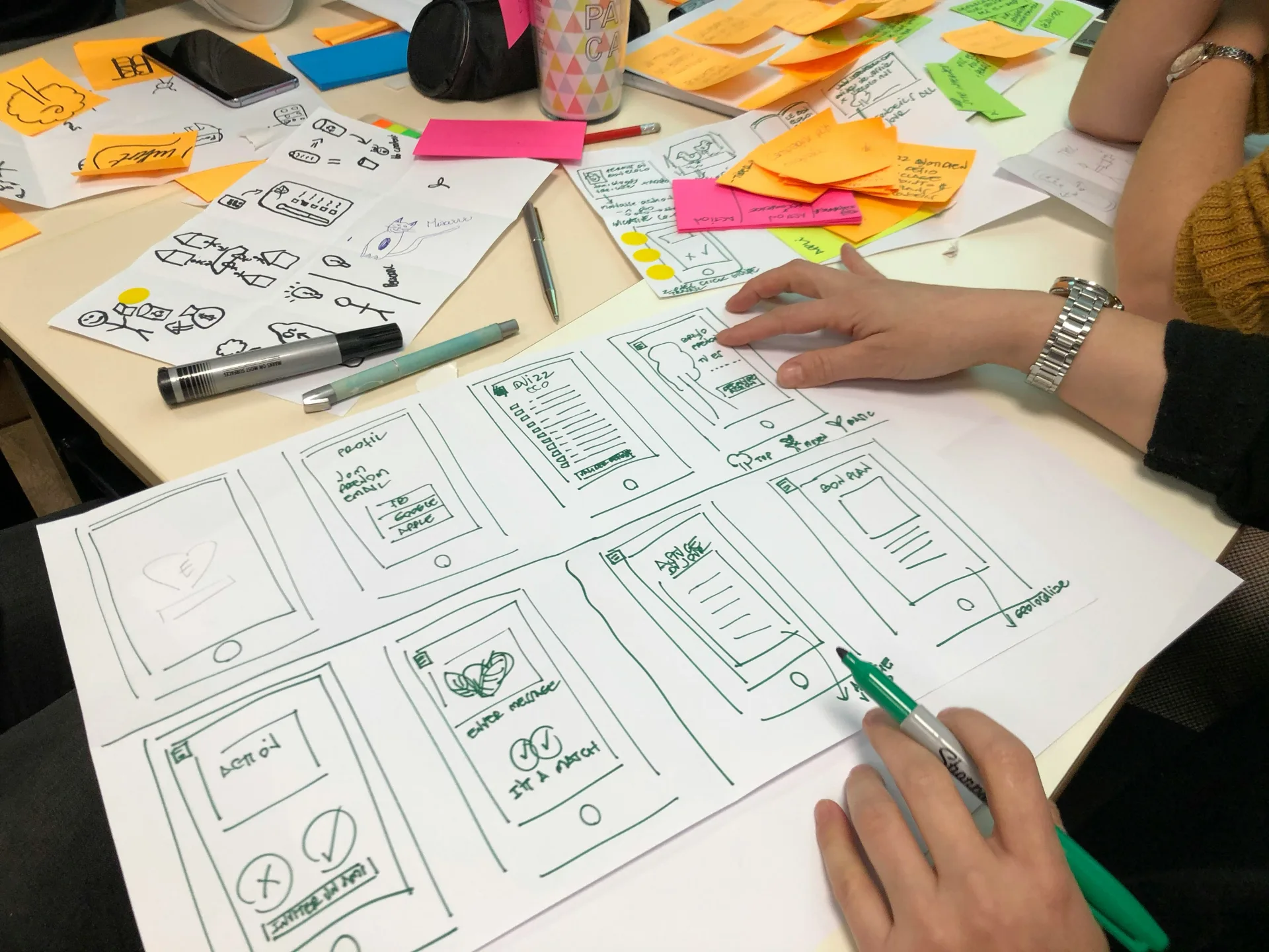
The deeper takeaway for any product team is process. Asian super-apps treat research as a living artifact — density decisions get revisited, promotions get killed, flows get shortened based on continuous data. Too often in Western agencies, insight ends in a beautiful deck that nobody reopens.
At Evocative, we push clients to keep research alive: turn findings into testable hypotheses, wire them to analytics, and let the interface evolve. AI accelerates this — you can now interrogate assumptions and re-run analysis in minutes rather than quarters. But the discipline is human. The question is never "does it look clean?" It's "does it move the metric that matters to this specific market?"
The Asian model isn't a template to clone; it's a mindset to adopt. Design for real intent, remove the right friction, feed your tools genuine context, and never confuse a shipped feature with a validated one.
Sources
- The terminal became my canvas — UX Collective
- Research shouldn’t end in a deck — UX Collective
- The brainstorm that couldn’t storm — UX Collective
- The feature trap — UX Collective
- The MOS 6502: the people’s princess — UX Collective
- What your AI co-designer can’t infer from your hex values — UX Collective