Key takeaways
- Flat design gained speed but lost the feedback cues that make interfaces feel trustworthy.
- Intentional motion should orient, confirm or guide — anything decorative gets cut.
- Lottie bridges the Figma-to-code gap with lightweight, shared animation artefacts.
- Document motion as a contract (duration, easing, reduced-motion) so it survives handoff.
- Treat animation changes as reversible bets and A/B them — no lab required.
For a decade, flat design won by subtraction. We stripped shadows, killed skeuomorphism and chased minimalism until interfaces became clean, fast — and forgettable. The next shift isn't a return to glossy buttons. It's tactility: interfaces that respond, breathe and confirm through intentional motion. Done well, this is the difference between a product people tolerate and one they trust.
At Evocative we see the same pattern across client work: users don't ask for more features (or more AI, for that matter). They ask for clarity and confidence. Motion, when it earns its place, delivers exactly that.
Why flat design left something on the table
Flatness solved real problems: performance, consistency, scalability across screens. But it also removed the physical cues that tell people where they are and what just happened. Without feedback, a tap feels like a guess. Tactile UX restores those cues — a card that lifts under a cursor, a toggle that eases into place, a loading state that reassures instead of stalls.
This isn't decoration. Motion communicates causality. It answers the user's silent questions: Did that work? What's coming next? Where did that panel go? When those answers arrive as smooth, physical-feeling transitions, cognitive load drops and perceived speed rises — even when the actual load time is identical.
Intentional motion, not motion for its own sake
The trap is obvious: teams discover animation and everything starts bouncing. Intentional motion follows rules.
- Purpose first. Every animation should orient, confirm, or guide attention. If it does none of those, cut it.
- Fast and honest. Most micro-interactions live between 150–300ms. Longer and you're making people wait to look clever.
- Physics people recognise. Easing curves that mimic real momentum feel right; linear motion feels robotic.
- Respect preferences. Honour prefers-reduced-motion. Tactility should never become a barrier.
Where Lottie fits
Lottie lets designers ship rich, vector-based animation exported straight from After Effects as lightweight JSON — no bulky video, no hand-coded keyframes. That makes it a strong bridge for the exact gap the industry keeps arguing about: the space between what lives in Figma and what lives in code. A Lottie file is a shared artefact both worlds can point to. Used surgically — an empty-state illustration, a success checkmark, an onboarding beat — it adds warmth without wrecking performance budgets.
Motion needs process, not just talent
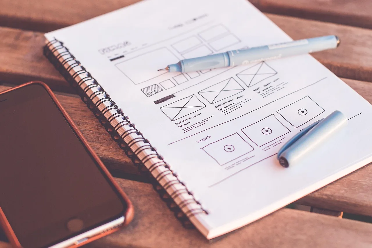
Here's where craft meets discipline. Beautiful animation that lives only in a designer's prototype is a liability — it never survives the handoff. The healthiest teams treat the interaction as a contract: an agreed spec (duration, easing, trigger, reduced-motion fallback) that neither Figma nor the codebase owns alone, but both must honour. That framing turns "make it feel nice" into something engineering can actually build and QA can actually test.
It also invites the smarter move: treat motion decisions as bets, not launches. You don't need a research lab to run a design experiment. Ship the animated confirmation to a slice of traffic, watch task completion and error rates, and let the data decide. Small, reversible experiments beat months of debate about whether a transition is "too much."
What this means for AI-era products
There's a useful lesson buried in the current AI hype cycle: people don't want technology shoved at them — they want it to feel effortless and trustworthy. Tactile UX is precisely that instinct applied to the interface layer. A well-timed transition that shows the system is thinking, or a subtle state change that confirms an AI action, does more for adoption than another dazzling feature. Motion is how you make intelligent systems feel considered rather than chaotic.
A practical starting point
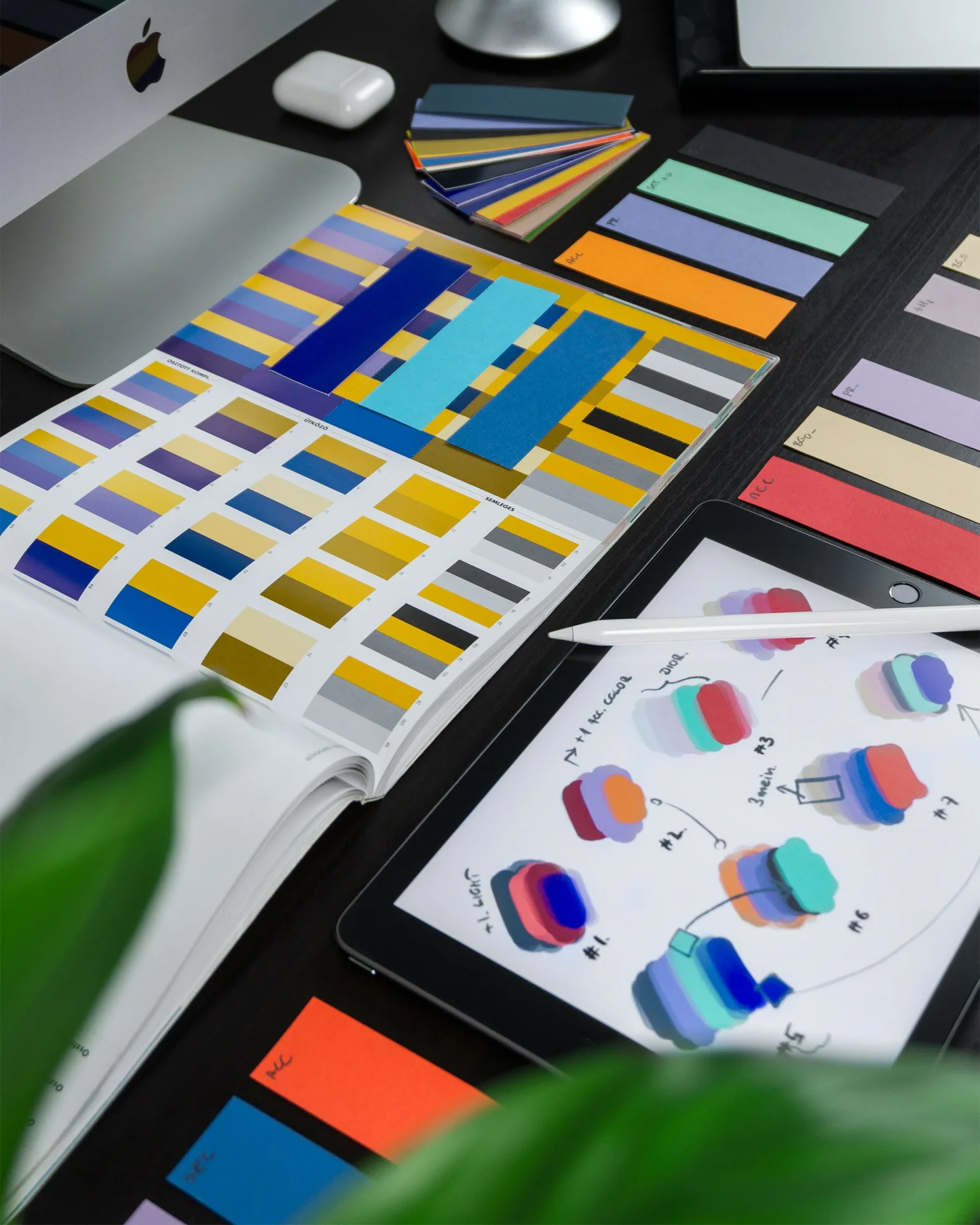
You don't need to redesign everything. Start where feedback is weakest:
- Audit your key flows for silent moments — taps with no response, jarring page swaps, ambiguous loading.
- Define a small motion spec: two or three easing curves, a duration scale, and mandatory reduced-motion rules.
- Prototype one Lottie moment where it genuinely helps, and A/B it as a bet.
- Document each interaction as a shared contract so it survives into production intact.
The goal was never to abandon flat design — it was to give it back its sense of touch. Interfaces that respond like they understand you don't just look better. They feel trustworthy, and trust is the metric that quietly compounds.
Sources
- UX Conference October Announced (Oct 5 - Oct 16) — Nielsen Norman Group
- No, People Don’t Want More AI In Their Life — Smashing Magazine
- From vibe to specs: reclaiming the design process with SAID framework — UX Collective
- Design system contracts: the component lives in neither Figma nor code — UX Collective
- AI just called design’s bluff — UX Collective
- Design experiments are more important than ever, and they don’t require a lab — UX Collective