Key takeaways
- Low conversion is almost always a friction problem, not a traffic problem.
- Page speed on product, cart, and checkout pages is a commercial metric — treat it that way.
- Surprise costs at checkout are the number one reason customers abandon; be transparent early.
- Make checkout feel inevitable: guest option, autofill, local payments, fewer fields.
- Fix the biggest funnel leak first with small tests, not sweeping redesigns.
The conversion gap is rarely a traffic problem
When a store stalls, the first instinct is to buy more traffic. It's the wrong instinct. In our work across dozens of e-commerce builds, we've seen stores double their ad spend and watch revenue stay flat. The problem is almost never the top of the funnel. It's what happens after the click, in the quiet, unglamorous mechanics of trust, speed, and clarity.
Stores that convert have one thing in common: they remove friction faster than they add features. Stores that stall keep adding — more banners, more pop-ups, more product variants — until the path to purchase disappears under the clutter.
Speed is a feature, not a technicality
We treat performance as a commercial metric, not an engineering one. A store that loads in under two seconds and a store that loads in five are two different businesses. The slow one leaks conversions on every single session, and no amount of persuasive copy compensates for a customer who has already left.
What matters is not just the homepage. It's the product page, the cart, and the checkout — the pages where money changes hands and patience is thinnest. Optimising image weight, deferring non-essential scripts, and choosing a fast hosting stack are not luxuries. They are the baseline.
Trust is built before the price is seen
People do not abandon carts because prices are high. They abandon because doubt creeps in. Converting stores earn trust in the first few seconds through signals that are easy to underestimate:
- Clear returns and shipping information visible before checkout, not buried in a footer.
- Real reviews with substance, not a wall of five-star clichés.
- Transparent pricing where shipping costs appear early, not as a nasty surprise at the final step.
- Human contact points — a visible way to ask a question reassures more than any badge.
Surprise costs at checkout remain the single biggest cause of abandonment we see. The fix is not clever. It's honest.
The checkout is where good stores win and bad stores die
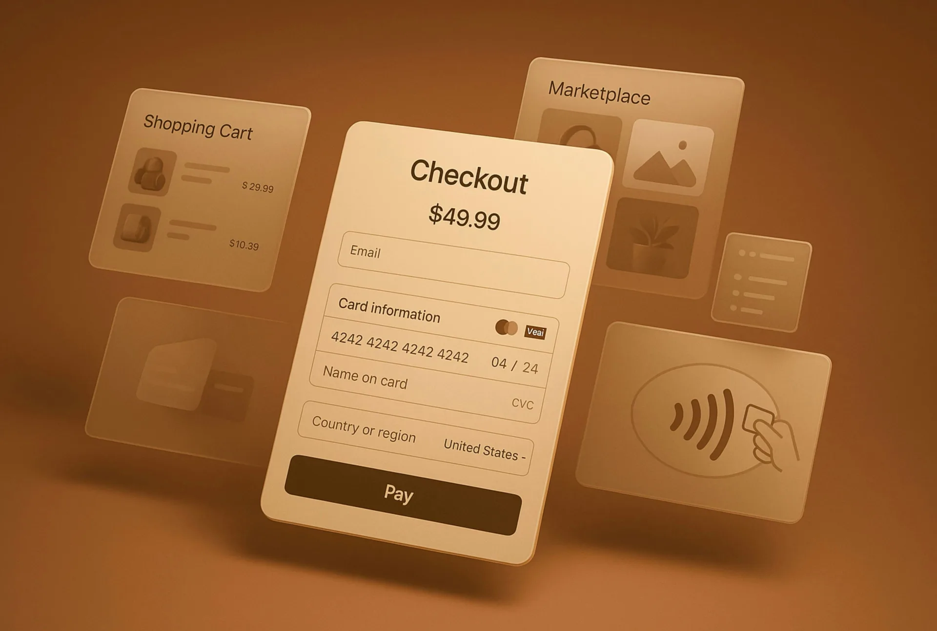
Everything upstream exists to deliver a visitor to the checkout with intent intact. Then too many stores throw that intent away. Forced account creation, ten form fields where three would do, no guest option, a payment method the customer doesn't recognise — each of these is a reason to close the tab.
Converting stores make checkout feel like the natural end of a decision already made. Guest checkout, autofill, local payment methods, and a visible progress indicator all reduce the cognitive cost of the final step. The goal is to make paying feel inevitable rather than effortful.
Merchandising for decisions, not for browsing

Endless scrolling is not a shopping experience; it's a maze. High-converting stores guide. They use category structure, filters that actually match how people think, and product pages that answer the real question — is this right for me? — with sizing guidance, honest photography, and specifications that pre-empt hesitation.
Where we increasingly add value is in using AI thoughtfully: smarter search that understands intent, recommendations that feel relevant rather than random, and automation that surfaces the right product at the right moment. Used well, these tools shorten the distance between arriving and deciding. Used badly, they add noise. The discipline lies in knowing the difference.
Measure the funnel, not the vanity metrics
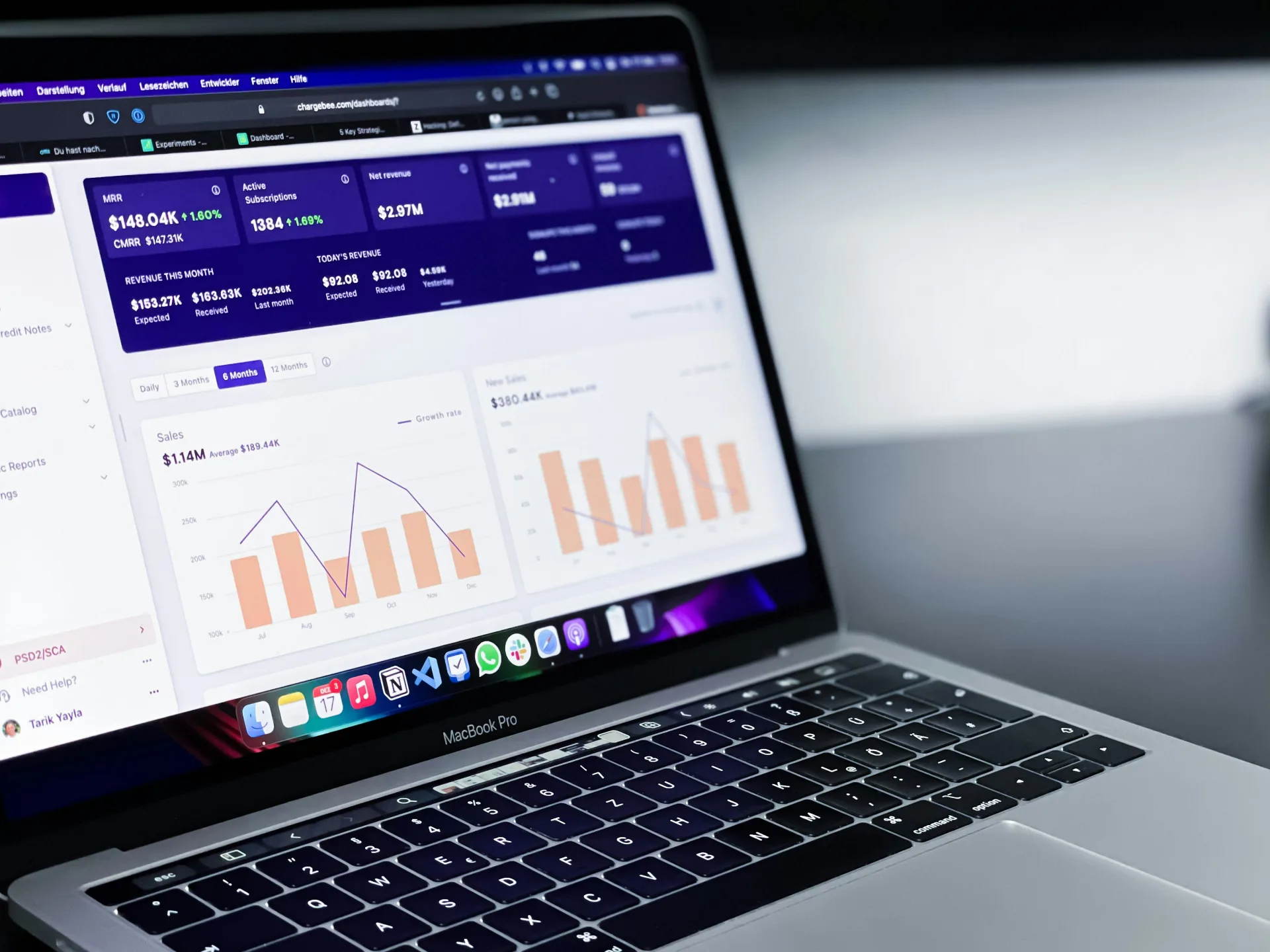
Sessions and page views tell you almost nothing about why a store stalls. The stores that improve are the ones that watch the drop-off between stages — product view to add-to-cart, cart to checkout, checkout to payment — and fix the biggest leak first. This is unglamorous work. It is also the work that compounds.
We favour small, testable changes over sweeping redesigns. A redesign resets your data and your learning. A steady rhythm of experiments teaches you what your specific customers actually respond to, which is worth more than any best-practice checklist.
The pattern, in one line
Stores that convert respect the customer's time, protect their trust, and remove every needless obstacle between wanting and buying. Stores that stall assume attention is infinite and patience unlimited. It never is.
If your traffic is healthy but your revenue isn't following, the answer is usually hiding in the friction you've stopped noticing. We'd be glad to look at your store with fresh eyes and talk through where the real leaks are — no pitch, just a clear view of what's working and what isn't.